Visualizing API landscape and health
Many people in recent years have jumped on the (micro) services bandwagon for many reasons. But, as with radioactively-spider-bitten-students, with great services come great responsibility... eh, well, observability.
As more and more services are introduced into your landscape, it becomes more difficult to keep track if services are running. More importantly, how do you quickly see which services are affected if one dies?
Healthy, what does it mean?
First things first: How do we know if a service is healthy?
Most services depend on other components to function properly, for example a database, a cache or another service. If any of these are not available or are not responding quickly enough, we can say that the service is unhealthy.
Still each service knowing abouth the health of its own components doesn't do us a lot of good just yet. We're in the "A tree falls in the forest and there is nobody there does it make a sound?" territory right now.
A first approach here is to have the checks log an error when it fails its criteria, something along the lines of Health test failed. We can now leverage our logging infrastructure (Splunk, ELK, LogzIO etc) to trigger alerts for us.
And then suddenly your Slack #operations channel contains these little messages:
[ERROR] ReallyImportantService is unhealthy
Ok, well now.
So obviously we know the service failed but we still need to resort to our logs and figure out what part of the service is failing. Database? Messagebus? ¯\_(ツ)_/¯
We need to go deeper
What we need is a way to ask the service itself what's wrong instead of digging through our alerts and logs. Given that we're dealing with API's that are accessible over HTTP anyway, maybe we should leverage that. We could create an endpoint on our API that provides us with the results of the health checks.
But why reinvent the wheel? Fortunately for us the folks at Beamly have already done a lot of the thinking for us. They came up with the Simple Service Status Endpoints or SE4 that defines four endpoints to quickly get information about the health of a service.
For our goal of seeing what is going on we'll be using these two:
/service/healthcheck/gtgwhich tells us if the service is OK (/gtg: good-to-go)/service/healthcheckwhich gives a list of dependencies and if they are OK
I won't go in too much detail (the linked doc does that better) but we now have a common way of accessing health information for all our services. You can imagine that this helps a lot when you have a lot of services, you don't need to write each integration separately.
Mapping expedition
Unfortunately we're still not a lot closer to where we want to be: a view of our landscape with health indicators.
Even though right now we can get detailed information about a service, we need a way to determine which service is using what. If you read the SE4 document, you'll see that each test has a test_name and we can use that to identify the dependency.
But how do we match identifiers to services?
You will probably have already adopted a naming convention for your services. Perhaps like this https://environment-domain-api.mycompany.com/ to create https://production-user-api.mycompany.com/. Your application name would be user-api and this is a good candidate for an identifier to use in the test_name for services that depend on the User API.
The problem is, we still need to find all our services. But before we can find our services, what environments do we have?
When you run your services in The CloudTM, you'll get the benefit of infrastructure management APIs. These allow you to inspect what you have deployed and where you can find these services (and many other things like configuration, firewall settings, you name it).
For example if you run on Azure, you could query App Service instances, on AWS you could look for Application Load Balancers or you can use Consul or Zookeeper on your own infrastructure.
My current discovery method is slightly less sophisticated: a config file.... but it does the job.
The key point here is that you use the data from service discovery to determine which services make up the landscape for a particular environment (and therefore what an environment means to you).
Pulling everything together we can now find out which services exist, what the relations are between them and what additional dependencies exist.
Visualizing
We have our discovery, naming and endpoints, but still we have no visual representation of the landscape. The next step is figuring out how to show this.
Fortunately there are a lot of libraries available to do this for us, vis.js is one I've found to work well. We can transform our list of services and dependencies into their graph equivalents: nodes and edges. The healthy state of the services and dependencies is then used to color the nodes and edges red or green.
A sample graph then looks like this:
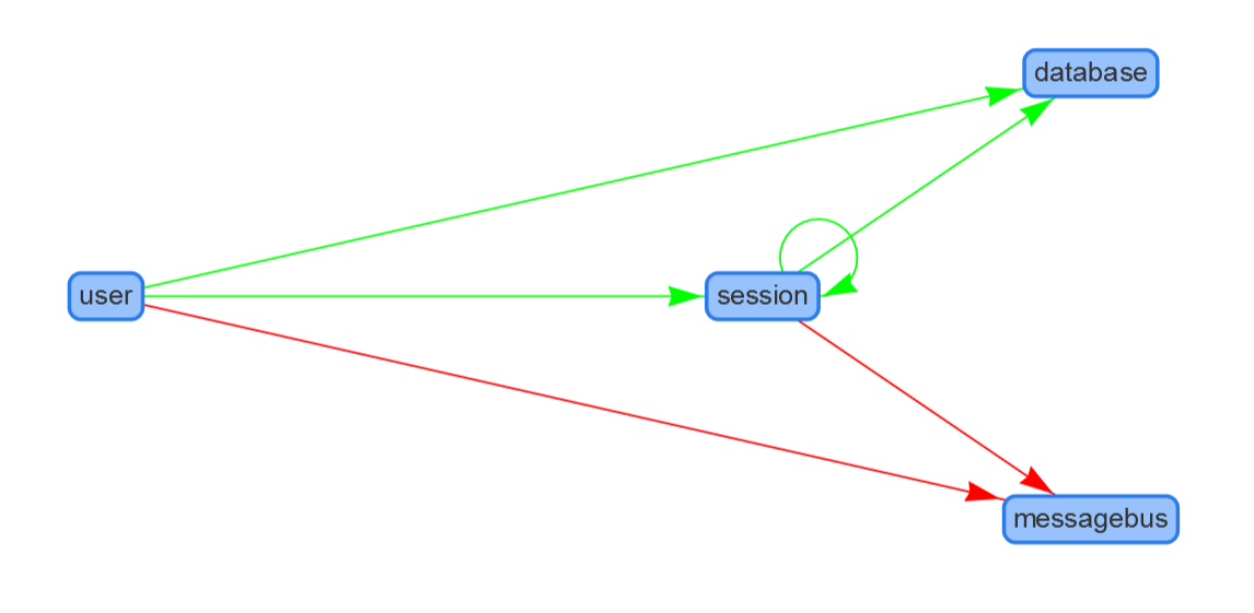
Of course this is a very simple example but I hope it gives you an idea about how it works in scenarios with many more services.
Wrapping up
We've seen how we moved from having no information on our service health to a visual overview that helps to quickly spot the problem and the scope of it. This can be a big benefit when alerts go off and you quickly need to diagnose a problem. It also allows you to easily communicate a problem scope to stakeholders.
At $company we're using Voltmeter which is an implementation of what I've talked about in this post. Hopefully you'll find it useful and it allows you to get started using this yourself to monitor service health.